

Ever walked into a beautifully furnished room and felt like something was just off, even though the furniture itself was gorgeous? More often than not, the culprit isn’t the style or color palette—it’s the proportions.
In a recent viral guide by Morrow Homes, interior design experts highlighted three critical sizing mistakes most homeowners make and shared the exact rules of proportion needed to fix them. If you want to transform your living space from cluttered or mismatched into an elegant, premium sanctuary, mastering these basic spatial ratios is key.
1. The Coffee Table Dilemma: Finding the Perfect Ratio
In most households, the coffee table is either an oversized island that blocks foot traffic or a tiny afterthought that sits stranded out of arm’s reach.
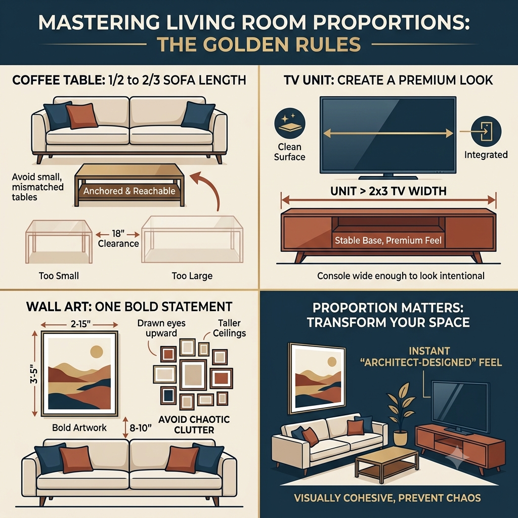
The Rule: To achieve a visually balanced seating area, your coffee table should be between one-half (1/2) and two-thirds (2/3) the total length of your sofa.
When your coffee table follows this golden rule, it anchors the seating arrangement without overwhelming it. It ensures that anyone sitting on the couch can easily reach for a drink while leaving an ideal 14 to 18 inches of clearance space on either side for comfortable movement.
2. The TV Unit: Creating a Premium Look
With televisions getting larger every year, media consoles are frequently left looking dwarfed and unstable under massive screens. A TV that overhangs or perfectly aligns with the edges of the stand creates a top-heavy appearance that breaks the harmony of your room.
The Rule: Your TV unit should always be wider than the television itself. Specifically, having the console extend far enough so that the TV occupies roughly two-thirds of the unit’s width creates a much more balanced base.
Giving your media console that extra breathing room on the sides provides an instant “premium look.” It gives you a clean surface to place a couple of minimal decor items, like a small vase or a stack of books, making the entire setup look intentional and integrated rather than cluttered.
3. Wall Art: One Bold Statement vs. Clutter
It’s incredibly tempting to fill an empty wall above your sofa with a gallery of small, mismatched picture frames. However, hanging too many small frames close together can instantly make a room feel chaotic and visually noisy.
The Rule: Instead of a scattered gallery, choose one large, high-impact piece of artwork. When hanging it, place the bottom frame 8 to 10 inches above the top of your furniture.
This specific clearance height ties the artwork and the furniture together as a singular, cohesive visual unit rather than letting the art awkwardly float on its own. It draws the eyes upward, making your ceilings feel taller and your living room infinitely more spacious.
The Takeaway: Great interior design isn’t about how much money you spend on decor; it’s about how pieces relate to one another in space. By following these simple 1/2 and 2/3 rules for your tables, consoles, and art, you can effortlessly give your home a high-end, architect-designed feel.
Watch Now: https://www.youtube.com/shorts/xJP4zp80sXs